
Overview
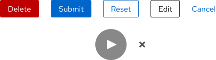
A button is clickable text or an icon that triggers an action on the page or in the background. Depending on the action, content, and hierarchy, a button can be used on its own or grouped with other buttons.
- Figma library
-
Ready - Responsive
-
Ready - RH Elements
-
Ready - webRH
-
Ready
Sample element
Demos
View a live version of this component and see how it can be customized.
<rh-button>Primary</rh-button>

<script type="module">
  import '@rhds/elements/rh-button/rh-button.js';
</script>
<rh-button> demo in a new tabWhen to use
- When you need to allow users to interact with pages in a variety of ways
- When you need to communicate actions users can take
- When you need to draw attention to the highest priority action
Status checklist
| Property | Status | Meaning |
|---|---|---|
| Figma library |
|
Component is available in the Figma library |
| Responsive |
|
Component responds to changing viewport sizes in Figma and the browser |
| RH Elements |
|
Component is available as a web component |
| webRH |
|
Component is available as a web component |
Related elements or patterns
Feedback
To give feedback about anything on this page, contact us.
Red Hat legal and privacy links
- About Red Hat
- Jobs
- Events
- Locations
- Contact Red Hat
- Red Hat Blog
- Diversity, equity, and inclusion
- Cool Stuff Store
- Red Hat Summit
Red Hat legal and privacy links

