
Overview
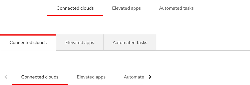
Tabs are used to organize and navigate between sections of content. They feature a horizontal or a vertical list of section text labels with a content panel below or to the right of the component.
- Figma library
-
Ready - Responsive
-
Ready - RH Elements
-
Ready - webRH
-
Ready
Sample element
Demo
<rh-tabs>
  <rh-tab id="users" slot="tab">Users</rh-tab>
  <rh-tab-panel>Users</rh-tab-panel>
  <rh-tab slot="tab">Containers</rh-tab>
  <rh-tab-panel>Containers <a href="#">Focusable element</a></rh-tab-panel>
  <rh-tab slot="tab">Database</rh-tab>
  <rh-tab-panel>Database</rh-tab-panel>
  <rh-tab slot="tab">Servers</rh-tab>
  <rh-tab-panel>Servers</rh-tab-panel>
  <rh-tab slot="tab">Cloud</rh-tab>
  <rh-tab-panel>Cloud</rh-tab-panel>
</rh-tabs>

<script type="module">
  import '@rhds/elements/rh-tabs/rh-tabs.js';
</script>
When to use
- When you need to group related information into different categories
- When users need to read sections of content in the same view without leaving the page
- When you need to group other types of content in the same view like forms, settings, dashboards, etc.
Status checklist
| Property | Status | Meaning |
|---|---|---|
| Figma library |
|
Component is available in the Figma library |
| Responsive |
|
Component responds to changing viewport sizes in Figma and the browser |
| RH Elements |
|
Component is available as a web component |
| webRH |
|
Component is available as a web component |
Related elements or patterns
Feedback
To give feedback about anything on this page, contact us.
Red Hat legal and privacy links
- About Red Hat
- Jobs
- Events
- Locations
- Contact Red Hat
- Red Hat Blog
- Diversity, equity, and inclusion
- Cool Stuff Store
- Red Hat Summit
Red Hat legal and privacy links

